
Woobull.com, a provider crypto asset market, and network data has added new charts to its Bitcoin price, momentum, volume, and volatility platform.
Bitcoin Price Building ‘Momentum’
The news was originally announced in a tweet by Willy Woo, market analyst and founder of Woobull.com
The “Bitcoin Momentum Chart” appears to lead the price of bitcoin (Similarly to the RSI and MACD, but specifically for bitcoin) as changes in crowd psychology tend to happen before prices do.

As Bitcoinist has written before, Bitcoin’s price is typically followed by public interest.
The indicator is also seemingly able to quantify price trends based on bull markets and changes in momentum plotted on a separate line graph. This indicator could help traders understand if a strong price trend is in force.
It should be noted that there is already a directional movement indicator that was developed in the 1970s named the Average Directional Index (ADX). The ADX appears to follow the same premise as the Bitcoin Momentum Chart — although this new chart might be easier for new traders to read and therefore understand.
Signaling and investment-related charts
Woobull seemingly offers traders and investors charts and data that they cannot easily find online. For instance, many, (if not all) of the charts on Woobull are sourced outside of the mainstream technical analysis sites such as tradingview.com or CoinMarketCap.
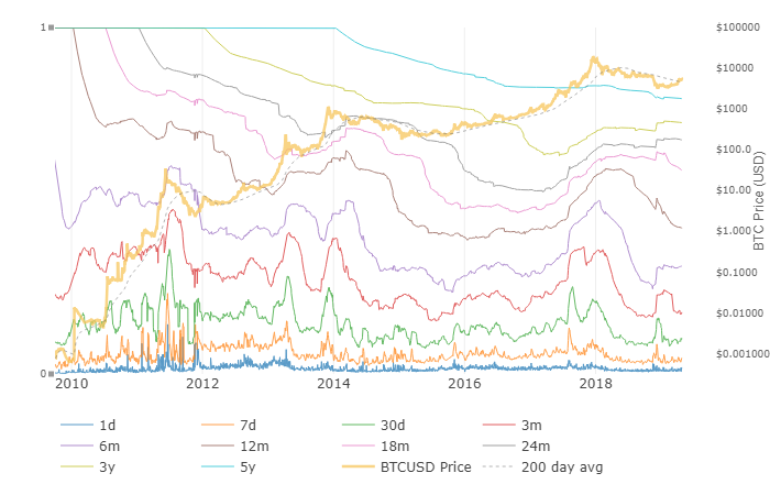
The site, therefore, might be more suited towards investors who look at long-term and secular trends than swing or day traders that look at the hourly candles. Still, the information provided from Woobull remains objectively useful for anyone with a technical or financial interest in Bitcoin.
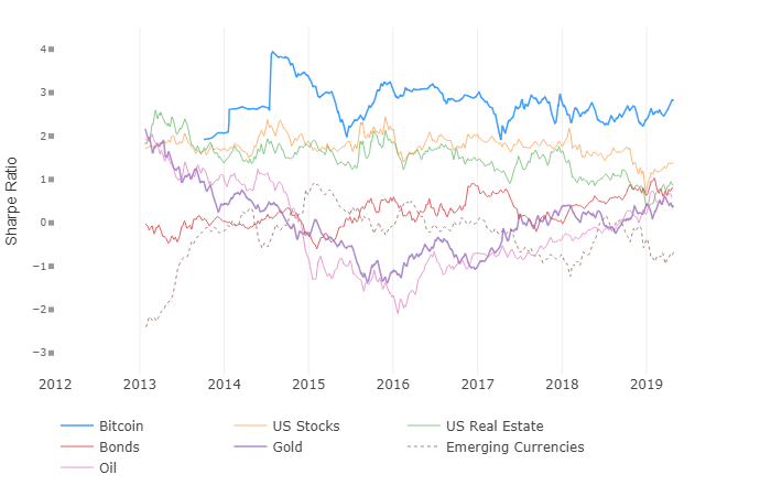
One interesting chart above is titled “Bitcoin Risk Adjusted Returns vs Other Assets.” The chart is used to “compare Bitcoin ROI, adjusted for its risk, to other assets.”
Another graph to pay attention to is its “HODL Waves” which claims to offer “A cross-sectional view of Bitcoin HODLers over time, shows demand and supply from new and old HODLers.”
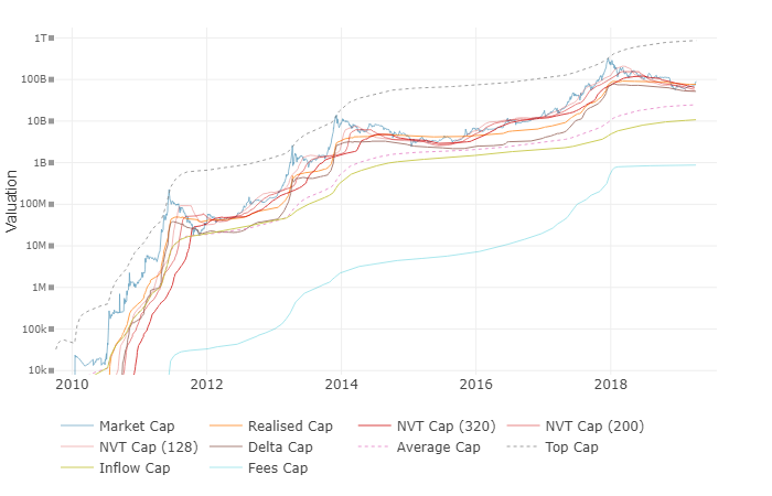
The Bitcoin Valuation cap shows “a collection of useful valuation metrics on Bitcoin.”
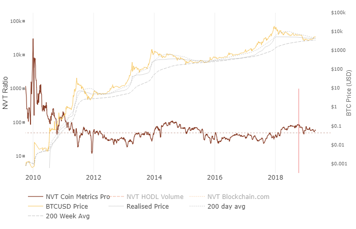
The Bitcoin NVT ratio shows when the currency is either overbought or oversold, which functions identically to the existing calculations of the RSI or stochastics that also measure extreme readings.
Bitcoin monetary and network statistics
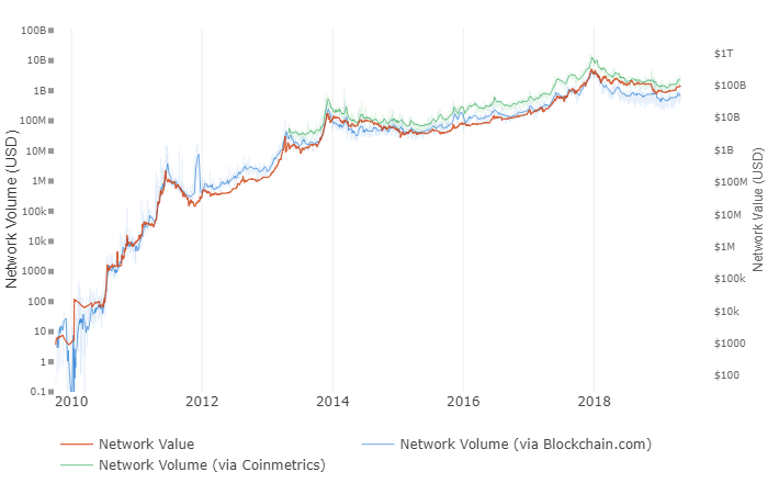
The below chart shows the difference between Bitcoin’s network value and network volume.
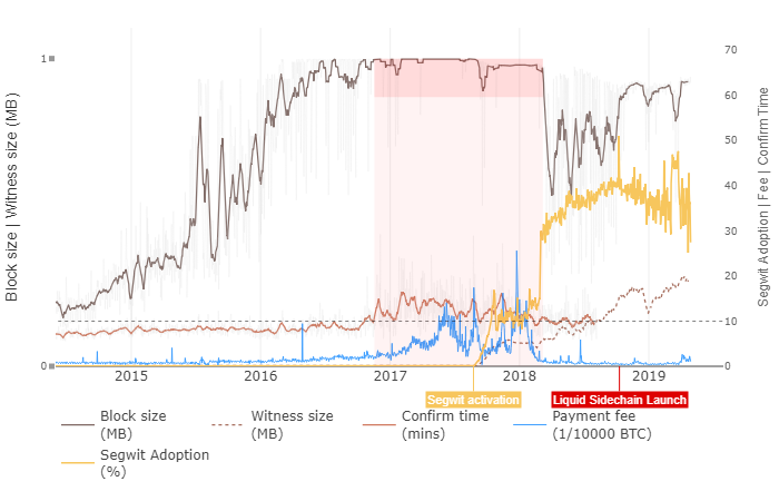
The graph below claims to “chart user-centric metrics tracking network congestion, e.g. payment fees, confirmation times.”
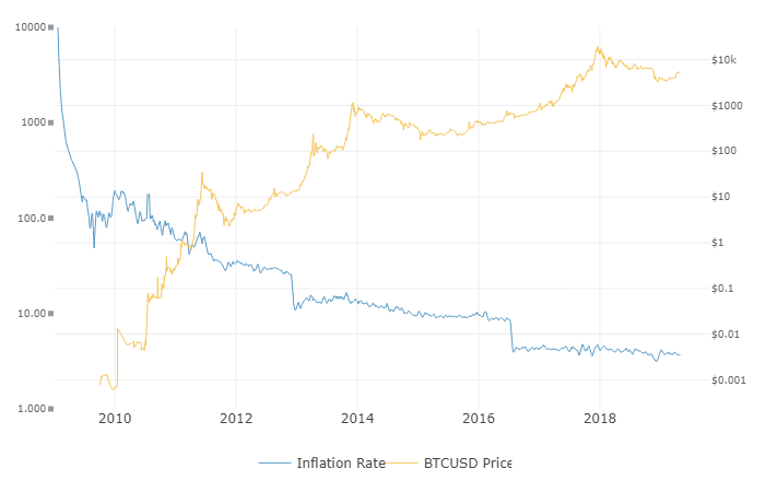
The graph below shows the growth (inflation) of bitcoin over time.
In closing, there are many more charts that WooBull offers that will be of interest to anyone invested in Bitcoin. Interested Bitcoiners are encouraged to check them out.
Will you be using Woobull in future? Let us know in the comments!
Image source: Woobull.com, Shutterstock
The post Bitcoin ‘HODL Waves’ Chart Shows Price Building Momentum appeared first on Bitcoinist.com.