
Image by Roland Sanchez
The One Chart We Need To Study And Why Bitcoiners Need To Move Away From The 1970s-Style Inflation Thesis
The first chart plotted below is deceptively simply, and yet extremely important. I would even make the argument that it is the most important chart to fully internalize so far in 2021. This is the signal through the recent noise of messy economic data.
Chart #1 below visualizes Nominal Gross Domestic Product (Quarterly GDP in actual dollars, annualized), divided by the Employment to Population Ratio (most commonly defined as prime age workers aged 25-54 as percent of total population).
A historic shift:
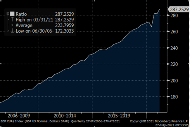
Chart #1: Nominal GDP / Employment-to-Population Ratio
Source: @LudiMagistR, Bloomberg
The Signal
What this chart is telling us is that already, a year after COVID brought the biggest employment shock in modern times, we have produced higher GDP in dollars relative labor employed. Ever.
Chart #2 plotted below is simply meant to emphasize where our employment levels currently stand in a historical context. It shows us how incredible the GDP growth is despite there still being approximately 15.35 million people filing unemployment claims in this country. That compares to about 1.6 million people filing claims prior to the COVID crisis, when GDP was $21.8 trillion.
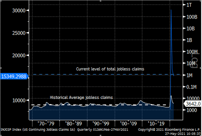
Chart #2: Total Jobless claims including all pandemic-era Federal programs (blue) vs pre-pandemic continuing jobless claims (white)
Source: @LudiMagistR, Bloomberg
Let us think about this for a minute. Currently, with GDP at a new high of $22.06 trillion, we have “accomplished” a 1.2% nominal GDP growth rate in defiance of a nearly 10x order of magnitude increase in the number of workers unemployed in that period!
I know many skeptics will argue that such a rate of GDP is not sustainable, and is driven by a temporary and synthetic demand from high transfer payments and the inflated personal income and spending that comes with such government programs. And while these facts are true, they miss the point. The point is that our economy can handle such demand at current levels of employment.
If Powell and the Fed are watching this, they must certainly be gnashing their teeth and wincing anxiously. If one’s goal is full employment, defined as getting job levels back to pre-pandemic levels, these facts are rather alarming.
The Emergence Of A New Debate: Deflation
Some signal-oriented thinkers like Jeff Booth have done an excellent job in delivering a message that frames the hurdles for a system of debt-based fiat. A system that necessitates higher inflation to propel it forward with an ever-increasing secular headwind of deflationary forces. Such forces result from the productivity fueled by exponential technological innovation and an increasingly digital world that simply does not require human labor at nearly the same scale as historically observed.
The Oversimplified Dichotomy Of Inflation Versus Deflation
It is my view that fellow Bitcoiners would be better served to stop broadcasting the inflation and hyperinflation narrative as the primary reason to migrate to the hardest, most decentralized money ever invented. Such a narrative has the unintended consequence of reducing bitcoin merely to digital gold alone. Such a reductionist conclusion is incredibly unfortunate as bitcoin is so much more than this, and is so much better suited for the epoch we have just recently begun. The other flaw in this inflation tale is that it could very likely not occur, at least not in the 1970s-era manner that many are expecting to unfold. The world is so utterly different from the decade of the 1970s today, that such a comparison is almost nostalgic in its oversimplified and stale rationales. However, before some bitcoiners explode at this statement in defensive recoil, let us pause and take a deep breath.
We don’t need this narrative at all. Let me repeat it. We don’t need this inflation narrative to unfold to be victorious. And when viewing the above charts, that is a good thing. Why give bitcoin opponents yet another Straw Man argument to burn at their alters? So let us shed this skin, so that these FUDsters are left without a flame to even fan in the first place.
The Forest For The Trees
This does not mean that inflation, in some phase state, is not occurring. But money is not necessarily inflating in the Keynesian textbook definition of more dollars chasing fewer goods and services. (Defined by such measures as the Consumer Price Index and other econometric inflation gauges that use average and aggregate prices based on baskets of ever-changing, and hedonically adjusted components). Alas, the circumstances are much more nuanced. Money is inflating, but is now doing so via Monetary Entropy, rather than by way of the superficial consumer and services headline aggregate inflation we typically use as our barometer. (For a deeper dive into the theoretical framework of monetary entropy, please see my essay linked above, titled B.I.T. Bitcoin Information Theory).
Currently, we are witnessing a lot of noisy post-pandemic reopening statistics, misleading base effects and short-term supply shocks after a year of lockdown and severe economic disruption. These strange times breed a tremendous degree of confusion, and overwhelm us in a cacophony of noisy data. Nevertheless, we must see the forest for the trees and not succumb to the yarns of the past. Memes such as “OMG look at lumber prices!!” are low hanging Inflationista fruit, an empty vessel of click bait. This is the noise. The signal is telling us that businesses have accelerated the shifts of productivity, automation, and digitization already well under way over the past 20 to 30 years. The ability to do more with less human labor. This is immensely more deflationary in the long run relative to any short-term commodity-driven disruptions.
How Central Bankers Think About Wealth Creation
“Since we decided a few weeks ago to adopt the leaf as legal tender, we have, of course, all become immensely rich.” -Douglas Adams, The Hitchhiker’s Guide to the Galaxy
Quantitative Easing (QE) is indeed insidious money printing, but not in the way characterized by most financial analysts and pundits. The real nuanced mechanism is actually much more problematic for fiat as it is significantly more financially destabilizing. This is because rather than injecting fresh capital into the real economy in the form of fractional bank reserves that enter monetary circulation through the extension of credit, such avenues are circumvented in favor of a speculative asset vector. However, given speculative assets ideally have free market pricing mechanisms that can make real-time agile adjustments, financial markets will constantly test the political resolve to support them. Such is a very important distinction relative to the behavior of the more deliberate real economy that lives outside of the domain of financialization, a domain that is shrinking by the day. In 2011, rock star venture capitalist Marc Andreessen famously opined that “software is eating the world”. But well before 2011, financial assets were already eating the world and in much larger quantities. Financial markets crave certainty in order to establish equilibrium fair value prices and confidence. Over time, when such tests are repeatedly iterated, history has proven a desire on the part of policy makers to maintain market confidence at all costs. Such a dynamic also adds to “short-termism”, as the incentive structure for the typical politician, technocrat and bureaucrat is etched along a very short time horizon and becomes matched by a new equally short time horizon for financial markets. This realization becomes ingrained as a pattern of moral hazard, and begins to dictate policy decisions to a greater extent. Once the government itself becomes reliant on QE to finance its own spending plans, it is game over. These counterproductive incentives become too difficult to overcome. This is why moral hazard is so dangerous. Such bridges, once crossed, become very difficult to retrogress.
Stocks And Bonds As The Embodiment Of Fiat Currency
Money Supply relative to economic activity (measured via the M2 $ / GDP $ ratio) is now 60% below its peak ratio in 1974 and has been in consistent but sharp decline ever since the financialization of our economy began in earnest in the early 1980s. Meanwhile, the stock market’s market capitalization relative to GDP has gone from about 40% of GDP in the 1970s to well over 200% today, an all time high. This is perhaps one of the more stunning facts to internalize out of everything I’ve said thus far.
Why?
Because this demonstrates how Money Supply (measured primarily as M0, M1 and M2 growth) is not required as the only mechanism to pump new money into the system. Keynesians and monetarist macroeconomists have defended QE as not actually being money printing, but bank reserve creation instead and thus non-inflationary. This is true, but only in a semantic and academic sense, using their own pre-defined measures of inflation. Measures that carry little relevance in modern reality. Talk about circular logic!
But the bigger problem with such definitions is they entirely miss the point. Why print more actual dollars, if banks are regulated into holding higher excess reserves, and are not going to turn them into credit anyway? Credit is the actual mechanism for money printing in our system. And money velocity (the residual multiplier effect on base money) has plummeted. In 1997, the velocity of money peaked at 2.2x and is currently dramatically down 50%, now sitting near an all-time low at 1.1x. That means that every $1 dollar of money in the system in 1997 was recycled over two times but now is not recycled at all. The Fed sees this declining velocity and becomes alarmed. In order to reach their goals they must therefore print 2x as many dollars as they previously did in order to have the same effect on broad money circulation. The timing of this peak is also interesting. This occurred right when the gears of moral hazard were really beginning to churn intently. Events such as the bailout of Long Term Capital Management and the concept of the “Fed Put” entered the economic zeitgeist, then the Asian Financial Crisis, topped off by the dot.com bubble all occurred within a few years of this peak in money velocity. It is also no coincidence that policies of financialization also began to accelerate during this period. In 1996 the Federal Reserve reinterpreted the Glass-Steagall Act to allow for more collaboration between money-center and investment banks. In 1996, Nasdaq futures began trading on the Chicago Mercantile Exchange. In 1997, the long term capital gains tax was reduced from 30% to 20%. In 1997, e-mini S&P 500 futures contracts also began trading. Then in 1999, right before the dot.com crisis, the Glass-Steagall Act was fully repealed and money center banks became fully entrenched in capital markets once again. In 2000, the Commodity Futures Modernization Act was passed, deregulating the financial derivatives market. This helped set the stage for the next crisis in 2008. The chart below shows a strong relationship between the growth in the quantity of money (M2 growth) and traditional measures of goods & services inflation (PCE Index) from 1970 all the way until about 1997, when these two paths diverged. Instead, money supply began to correlate much more with financial assets like the stock market.
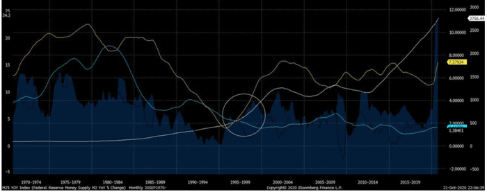
Chart #3: Money Supply Growth, 4yr moving average (yellow); Consumer Price Index, 4yr moving average (blue); The S&P 500, 4yr moving average (white)
Source: @LudiMagistR, Bloomberg
Such policies and events as those listed above represented an intentional and aggressive shift in money creation. A more potent economic policy ideology was realized to induce the inflation of asset prices via deregulation, lower capital gains taxes, leveraged financial product innovations, and passive investment vehicles such as exchange traded funds (ETFs). ETFs for example, can be thought of through the Silicon Valley lens as a technological innovation enabling a better user experience for individual investors, stimulating greater equity market adoption and fungibility for the public. Adoption and fungibility are the key attributes here. Since the dot.com era, more such ‘innovations’ were then developed, such as creative derivative instruments housed within a new shadow banking architecture to better propagate household debt and earn large fees in the process. I am of course referring to the period leading up to the real estate bubble and the financial crisis of 2008.
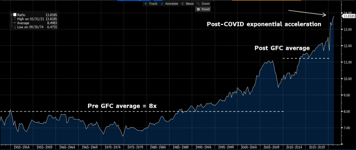
Chart #4: Ratio of Household Net Worth / Nominal amount of wages & salary in the US. Current ratio as of Q1 2021 is 13.8x, a record by a mile. Pre Great Financial (GFC) crisis average was ~8x. Post GFC, but prior to COVID it was ~ 11.5x. Where is this heading in the next 5 years?
Source: @LudiMagistR, Bloomberg
Inflation Is An Alchemist’s Time Machine And The Cat Burglar Of Our Future
A recent iteration has been the gargantuan issuance of corporate debt, at its most base level, designed to boost equity returns in the post-2008 era up and through today. This has gone hand in hand with stock market inflation, similarly fueled by perennially subdued interest rates. So the themes of the past decade have been corporate and government debt proliferation and dramatically lower nominal interest rates. Wall Street froths at the mouth at such lower rates, using convoluted descriptions to describe this situation as an improved “discount rate environment”, justifying a “lower equity risk premium”. What they really mean is that such circumstances make the stock market number go up. This is because for long duration financial assets that have high projected future cash flows (such as the growth stocks that dominate the stock market today), analysts tend to determine the present value of these future cash flows using “discounted cash flow” (DCF) models that take a prevailing discount rate (usually the risk free rate like the long term treasury yield, plus some risk spread) to deflate those future earnings so as to arrive at an intrinsic value today. The lower the discount rate, the higher the present value. Ta da! If this sounds a bit like alchemy to those readers not employed in finance, that is because it basically is. A lower discount rate essentially is just a theft of future value by the present. Historically, in freer times, interest rates fluctuate based on market dynamics and the prevailing equilibrium time preferences. Consequently, any DCF model historically was just an oscillating cycle of value being extracted from the future by the present as rates declined, and then returned back to the future once rates moved higher again. But with rates now continuously suppressed out of necessity by the Fed, this has become a PERMANENT theft. This is why we tend to witness more “winner take all” businesses, and more dispersion of success between those with access to capital and those without access. And just in case there are any delusions that the current policy is not indeed permanent, let it be reminded that the Federal Reserve as of the end of 2020, now holds more U.S. Treasury securities than all foreign central banks combined. Last year, the Fed’s treasury holdings increased 95%. In comparison, during the 2008 Great Financial Crisis this level of holdings only increased 25%. Apparently, each crisis gets “greater” than the last. In this case, the degree of “greatness” was nearly 4x that of the previous crisis just ten years prior.
There is something profound about this realization of permanent time theft once we zoom out and try to absorb its myriad implications. In theory, the potential future supply of capital is infinite as long as time does not end and as long as we continue to have faith that the world improves over time and creates ever more abundance and affluence. For now, these two key assumptions remain intact. Out of desperation we have synthesized ways of funnelling this capital with an alchemist’s time machine back into the present. The implications are that we now can create a theoretically limitless amount of money in the present by convincing one another of the prospects for a brighter tomorrow in one breath, while stealing from that future conviction before even exhaling. This is an inflation of epic proportions.
Financial Assets Are Now Fiat Stores Of Value
In a recent interview, legendary investor Stanley Druckenmiller noted that corporate debtors were net borrowers of $1 Trillion in 2020. I work in this industry and witnessed this insanity first-hand. And as Druckenmiller noted, we have never in history seen private debt go up in a recession prior to last year. Typically in downturns, private debt collapses by as much as $500 Billion in today’s dollars, so we’re talking about a 3x increase in leverage in this recession relative to the normal pattern.
We’ve slowly been encouraged for over 30 years now to hold assets as a perceived store of value, including equities, debt and real estate. Yes, real estate has always been a store of value throughout human history, but not the equity portion of a leveraged real estate investment that underlies our current form of ownership. Even in the early days of fiat, loan to value (LTV) ratios were ~ 50%. Most other countries still have LTVs this conservative. But in the US we have gone from 50% to a bottom near 0%-10% in ’07, and back to a slightly less emphatic 20% norm today. But this is still debt, not actual real estate. It is basically “fractional real estate”, a claim on it. A way to promote greater adoption without having to address thorny issues of valuation and affordability. Perhaps a new Bitcoiner meme should be “Not your lien, not your house”.
So the implicit and subconscious narrative over the past quarter century is “Why hold cash? Instead, hold the assets that are inflating via implicit guarantee behind that cash”. How then are financial assets any different than fiat as a bearer instrument? Moral hazard therefore is how you print money today. Extend the risk-free addressable market. Stimulate adoption with both carrot (moral hazard) and stick (stealth debasement of cash and savings without damaging the fiat’s reputation and status), and provide easy on-ramps. Voila! This outcome is what QE has been most advantageous in realizing.
The Opportunity Cost Of A Hundred Years
Rather than focusing on the impending inflation decade, what we should be focused on is how much deflation we could be achieving if we were to stop hopelessly fighting it. We cannot battle the progress of innovation and technology. We cannot put the rabbit back in the proverbial hat when it comes to the tsunami of compounding innovations of the recent past and near future, and what they imply for human labor. What levels of deflationary abundance would we have already accomplished after a century and a half of accelerating technological innovations, most of which occurred during regimes of increasing centralized coordination over economic activity and an eroding ethos of the liberal doctrine.
“Liberalism had to rely largely on the gradual increase of wealth which freedom brought about, it had constantly to fight proposals which threatened this progress. It came to be regarded as a “negative” creed because it could offer to particular individuals little more than a share in the common progress—a progress which came to be taken more and more for granted and was no longer recognized as the result of the policy of freedom…It is important not to confuse opposition against this kind of planning with a dogmatic laissez faire attitude. The liberal argument is in favor of making the best possible use of the forces of competition as a means of coordinating human efforts, not an argument for leaving things just as they are. It is based on the conviction that, where effective competition can be created, it is a better way of guiding individual efforts than any other.” ― Friedrich A. Hayek, The Road to Serfdom
An impartial and inquisitive society should be conducting a fair and honest inquiry into the question of whether we have truly ever experienced a free-market and Liberal society. And if money is one of humankind’s oldest instruments of freedom, can a centralized and fiat-evolved monetary system contain the necessary ingredients for a genuinely free society? If the answer to these questions is indeed a resounding “NO”, then one must then ask how the bounty of innovations humanity has achieved in the modern era could have led to an even greater degree of progress and wealth creation had they inhabited a better system all along? And further, how could those achievements have compounded over time to arrive at a completely different place than where we find ourselves today? The opportunity cost of having not followed this path is near incalculable. Alas, we cannot alter the past, but we can certainly aspire to avoid such pitfalls in the future.
“..Not that the system of free enterprise for profit has failed in this generation, but that it has not yet been tried…” – Franklin D. Roosevelt
The Story We Should Be Telling
The current fiat system, and the monetary and fiscal policies that have evolved to sustain it, will not necessarily lead to 1970s-style headline inflation figures because our world is drastically different. But these policies and the behaviors they invoke will continue to lead to prodigious economic damage.
The trajectory of the current system is spreading a cancer that is slowly eating away at our free market institutions and our future prospects, with a laundry list of destructive characteristics: moral hazard, extremely misaligned allocation of capital, a vulnerability to cronyism, populism, and ‘Cantillionaire’ creation, greater amplitudes of wealth inequality, abject financial instability and fragility, greater centralized planning, and more censorship to maintain control over this increasingly volatile foundation. Finally, yes, even pockets of traditionally defined inflation from effects such as Baumol’s Cost Disease (most notably in healthcare and education, two essential and inelastic services).
The trajectory of the current system also importantly requires more debt in a mounting negative feedback loop. The debt is not just a function of trying to solve a problem with the completely wrong solution, but also a requirement of the resultant government debt burden and its intractable servicing costs. QE and fiscal policy have become so intertwined that differentiating our current political economy from ideologies such as Modern Monetary Theory has become a truly Herculean task requiring skilled academic gymnastics to deflect. The end game ever and always in these cycles is a subsidy of government borrowing. In the world of macroeconomics we refer to such behavior as financial repression. With a growing level of unemployment without a commensurate decline in the cost of living, our current system will require greater and greater piles of social spending to compensate. This means more debt, which crowds out ever more new capital and further damages the system in a spiraling degeneration.
The laundry list of problems just stated are all existential issues for our fiat system, but none of them require a dramatic realized rise in any aggregate inflation gauges to have disastrous consequences and lead to continued debasement of fiat currencies. So if we use existing aggregate inflation gauges as our barometer, then loyalists of the current system will continue to get away with dismissing the skeptics and confidently reassuring the masses that all is well in the world of fiat.
But all is not well. We sense it, we smell it, and we taste it. As mentioned above, the fiat system has devolved, backed into a corner, surrendering to a life of crime and stealing from our future selves. The problem with such theft is multifaceted. First, not everyone is a thief, but every future self gets robbed. Consequently, a Prisoner’s Dilemma Culture is constituted that incentivizes everyone to participate in this robbery so as not to get left out in the cold, holding the proverbial bag. Unfortunately, not everyone can participate in such a game, especially those who are not even aware of what game is being played. A second problem is that this dynamic breeds instability and fragility. The more we chip away at our future’s building blocks the more we must hope for new blocks to be constructed to replace those missing from the edifice, lest the foundations begin to crumble and decay. If we lose faith in the future, the entire illusion evaporates. We are then pressured by an imperative to constantly sell our present selves increasingly seductive visions of future prosperity no matter how vague and unsubstantiated they might be, and no matter how much our current behavior reduces the probability of such a fate materializing. No wonder we live in the age of the pump and dump, the story stock, the SPAC (blank check companies that literally derive their value from the ability to sell a story about a potential future asset that does not yet exist), and many other examples of our escalating abuse of the future.
Taking Our Hands Out Of The Cookie Jar
The types of inflations unearthed above should worry us to a much greater extent than any 1970s-esque overt cyclical inflation that generates uncomfortably higher gas, food, and electricity bills. The reason is that the above types of inflation are insidious and shockingly easy to obfuscate, while the second type is obvious and relatively easier to address if the political and public will exists. This is the story that bitcoiners should be reporting and exposing.
I will conclude with one more related point. By focusing our attention only on the shorter term goods and services type of inflation we’ve been instructed to fix our gaze upon, we unwittingly deemphasize consistent but low headline inflation. We refashion something unacceptable into something mundane. Policy makers and government officials have told us over and over again that such inflation is not only innocuous, but actually desirable. But by decrying 4-5% inflation as a sign of impending monetary ruin, we minimize the degradation caused by a quarter century of compounding 2% targeted annual inflation. We are acquiescing to a 50% erosion of our purchasing power every 20 years as a matter of course! I am reminded here of Goodhart’s Law, observing that when a measure becomes the target, it ceases to be a good measure. Low but steady inflation can be gamed by the owners of capital within such a system. Low perceived inflation also fuels greater moral hazard simply because of its assumed predictability. The more predictable the target is, the more risk one can take in gaming and outmaneuvering that target. So financial leverage and indebtedness inevitably rise, capital misallocation increases, and a false sense of permanence and stability entices us to reach deeper and deeper into the cookie jar of the future, hoping that nobody notices there are almost no sugary treats left to pilfer.
All of this may sound dire for the economic prospects of our children. But this is also why bitcoin is such a beacon of hope for many of us, and why its transcendent power is often so intensely appreciated once these challenges are fully comprehended. Bitcoin puts the cookie jar back in the cobwebbed upper reaches of the kitchen cupboard, liberating us from the temptation to reach for that glutinous midnight snack.
This is a guest post by Aaron Segal. Opinions expressed are entirely their own and do not necessarily reflect those of BTC, Inc. or Bitcoin Magazine.